
ICA - UX Designer

ICA - UX Designer
Role: UX Designer
Tech: Figma, Accessibility
Year: 2022 — 2023
In my role, I collaborated with other UX designers, visual designers, and UX writers to integrate user insights and innovative ideas. Partnering with developers and product owners, I focused on user experience, design strategy, prototyping, and accessibility. I valued knowledge sharing, continuous learning, and cross-functional teamwork, aiming to refine ICA's digital offerings through strategic design.
I worked on "Minbutik," an internally developed system for ICA's 1300 retailers, available as a web and app application for iOS and Android. The project aimed at a significant technical and user-centered transformation. My contributions included research, user interviews, process mapping, wireframes, prototypes, and mockups, focusing on improving user experience and accessibility.
Min butik
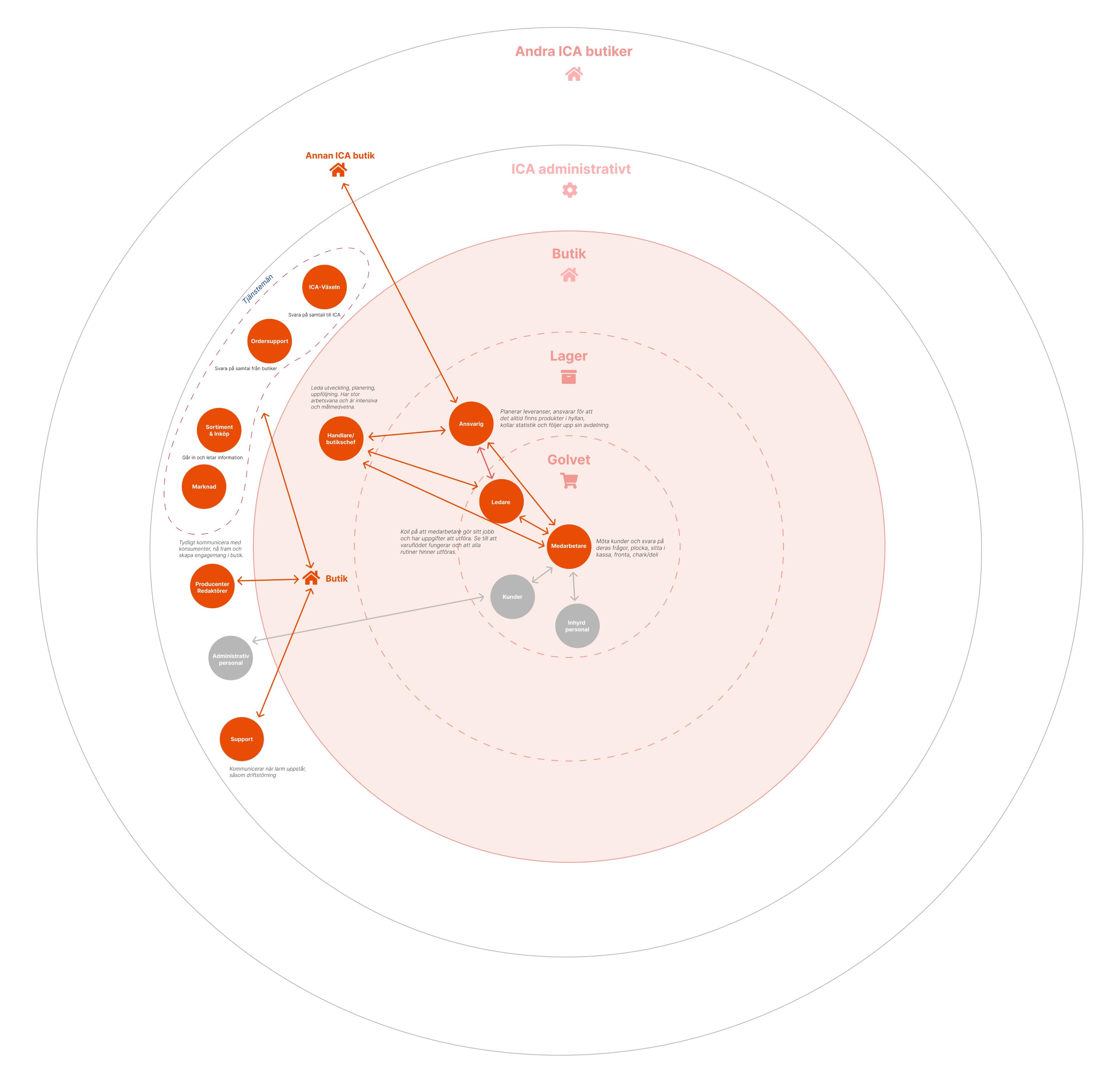
There are over 1,300 ICA stores in Sweden, each operating as its own registered company. These stores function independently, with the headquarters providing support. This decentralized structure places extra pressure on ICA's IT infrastructure, leading to the creation of Minbutik.
The platform aims to consolidate all IT systems into a single application, allowing stores and coworkers to access IT-related services in one place. Initiated in 2018, the initiative has grown, with more applications being integrated into Minbutik. The latest addition, which I worked on, was the intranet platform.
UX Research
Initially, the project aimed to bring UX and UI expertise back in-house. For over 5+ years, ICA has relied on a digital design agency for these competencies. While the agency excelled in interaction design, it lacked strength in UX research and had minimal contact with store employees. This led to many assumptions about user navigation and system usage.
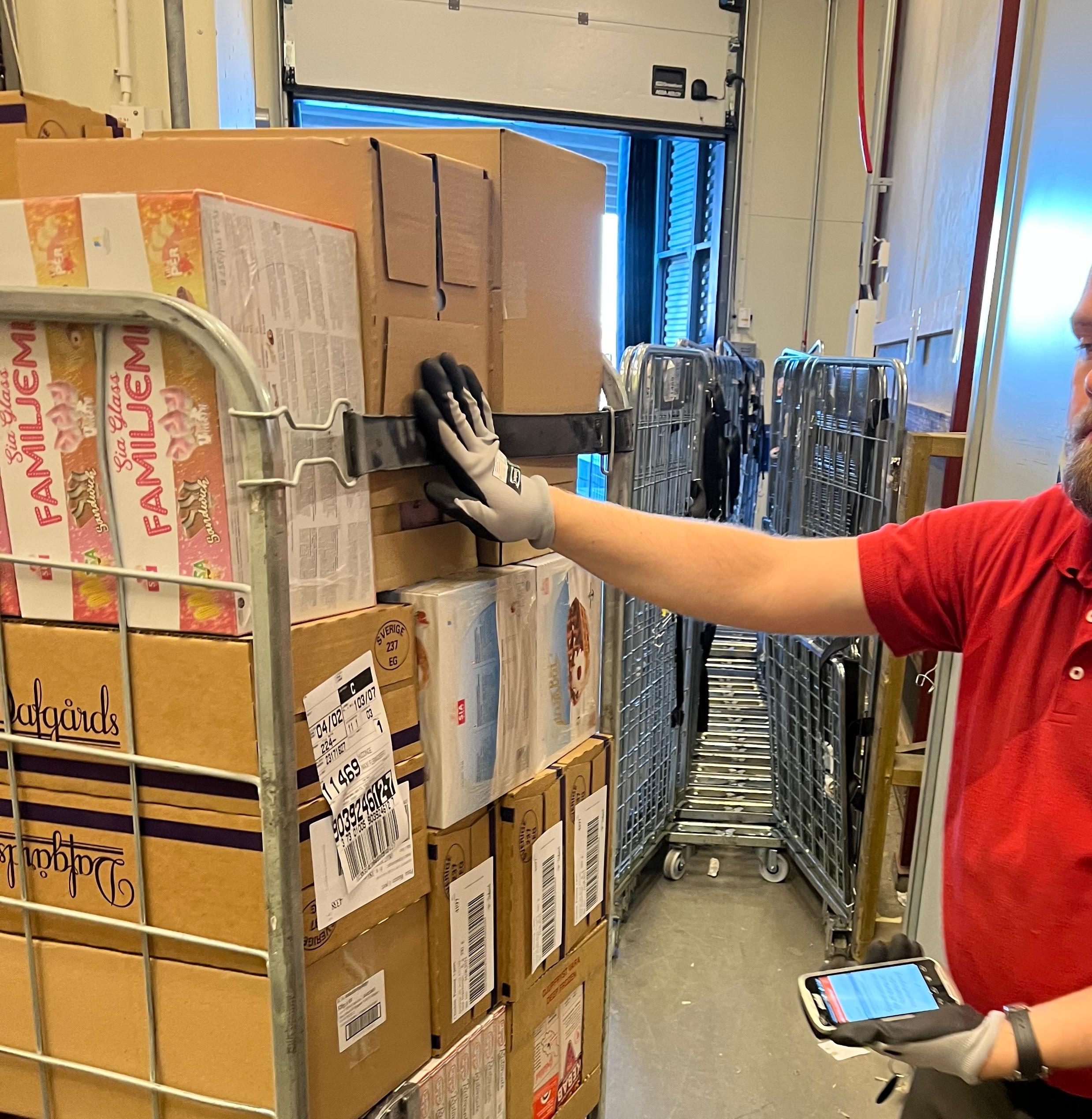
My focus was to understand user needs and identify pain points from ICA's perspective. I aimed to implement small, impactful changes to improve the product. To achieve this, I conducted extensive field studies, visited stores, and engaged with shop owners and coworkers to understand their workflows. These visits were crucial for gaining a deeper understanding of user needs, a critical aspect of our user testing process. These experiences significantly enriched our knowledge, providing profound insights that will influence our careers and enhance our approach to developing effective digital solutions.
Interesting insights were:
🏃♂️ Stressful environment
⏳ They work with tight margins and need things to happen quickly, making it essential to find information in under two minutes.
🖱️ Importance of minimizing the "amount of clicks" in the system.
🔍 Access to the most important information first is crucial.
📱 They prefer to see only what is relevant, regardless of the device used.
UX Design
My role as a UX Designer involved not only research but also sketching, wireframing, and designing flows. We had to manage complex workflows, as several old systems were being scrapped and integrated into "Minbutik." This required us to understand the old systems, design a good UX experience, and balance these efforts against budget and time constraints. The latter was particularly challenging, as many projects were already behind schedule, and there was significant pressure from leadership to deliver.
Unfortunately, this pressure sometimes led to compromises in UX, which negatively affected store users. This resulted in unnecessarily complex interactions, whereas simplicity should have been the priority. Despite these challenges, compromises were necessary, and the final results were acceptable, though not perfect.
Prototyping
I created several Figma prototypes, including ones for the delivery of goods and parcels, and the intranet platform. These prototypes were tested with users using various methods, such as think-aloud analysis, where users explained their thought processes and provided feedback on the prototypes.
I was responsible for creating and testing these prototypes, gathering user feedback, and sharing it with product owners and the rest of the design team. We collected valuable insights, which were then shared across ICA to inform and improve our designs.
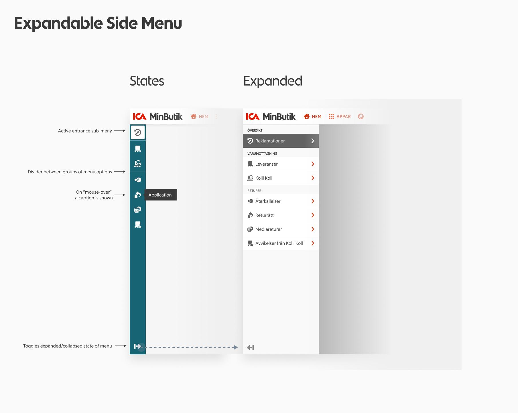
Design system - icaElements
ICA has been a great learning environment where I gained valuable skills in Figma, especially in using auto-layout and design tokens. Previously, we used Sketch, which was cumbersome. Starting with Figma from scratch allowed us to leverage its new features, making our design process quicker, more responsive, and iterative. This enabled us to create a comprehensive design system in Figma that all designers could use.
I also initiated the synchronization of the code in Storybook with the Figma UI to ensure consistency and avoid discrepancies. This was crucial during the implementation of the intranet into the Minbutik platform, where we often had to build new components on the fly due to tight deadlines. This added stress to the design system team, requiring quick decision-making and compromises.
Design guidelines
We had several guideline files for developers that were originally in Sketch and hard to find. I took the initiative to consolidate these guidelines into a single Figma document, linking them and using Figma components from the Minbutik UI design system. This made it easier for developers to follow and understand how interactions should happen and be coded.
The focus was heavily on pixel perfection, often at the expense of UX, which I found problematic. I actively worked to educate the team about the importance of questioning old assumptions and prioritizing UX. Over several months, I conducted continuous education sessions to help personnel understand what UX is and why it matters. My work was crucial in helping business owners and product owners see the value of UX beyond just aesthetics.
Google Analytics (GA)
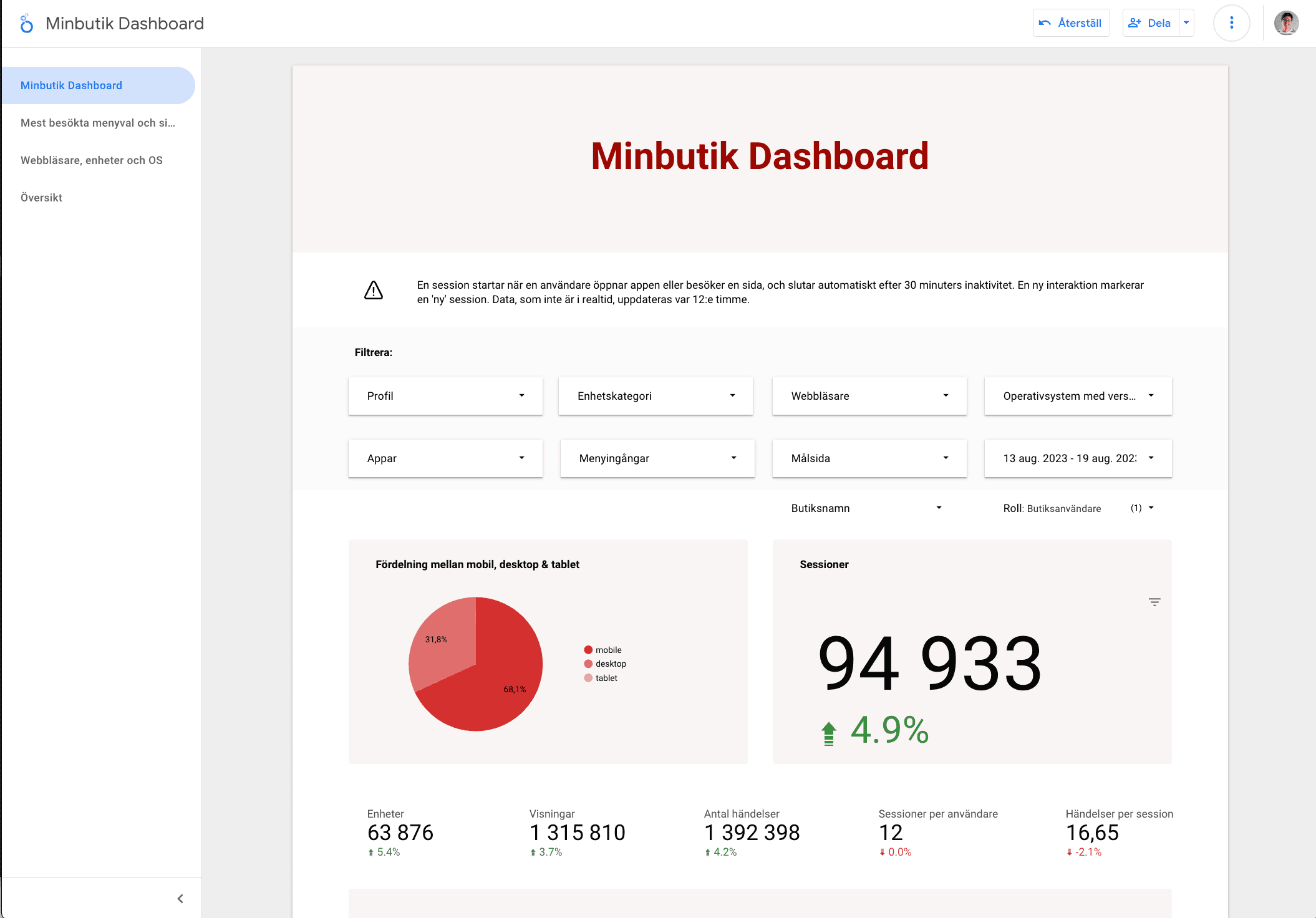
To gain a better understanding of user interactions with the application, I utilized Google Analytics (GA) to analyze behaviors and patterns, identifying the most used applications within Minbutik. Additionally, I learned to integrate GA with Looker to create comprehensive dashboards. This allowed us to visualize data effectively, providing insights into user behavior and application usage.
Looker studio
Using Looker Studio, testers could easily identify the most commonly used devices, screen sizes, and applications. With these statistics readily available, it was easier to debug user reports and determine the extent of issues related to specific devices or OS versions, allowing testers to focus their efforts more effectively.
The dashboards also helped Product Managers and other stakeholders understand usage patterns, highlighting which applications were most and least used. This data-driven approach facilitated better decision-making and resource allocation.
Hotjar
Hotjar was used to analyze UX patterns, recordings, and survey results. By leveraging Hotjar, we complemented the user research and interviews, allowing us to quickly identify issues on specific devices and understand user interaction with the applications. Hotjar helped us track how users navigated to their goals, whether they encountered unexpected errors or dialogs, and the sequence of clicks they made.
Surveys conducted through Hotjar allowed us to gather user feedback on the application, including NPS scores and overall satisfaction. We could measure user happiness, assess whether the application improved their workflow, and gather suggestions for improvements. This holistic approach provided valuable insights to refine the user experience and address any pain points.