FlowFactory / Siemens
Role: UX Designer
Tech: Figma, Accessibility
When: Aug 2024 — October 2024
Background
I was part of a UX design team tasked with improving DIOS, a complex sales management system used by Siemens. The project started in August and aimed to enhance the user experience for a growing user base across 18 countries.
The problem
DIOS had grown organically over time, resulting in an overloaded and confusing interface. Users struggled with navigation, information overload, and inefficient workflows. The system needed to be simplified and made more intuitive, especially for new users, while maintaining functionality for experienced users.
What I did on this project
As a UX designer with a focus on accessibility and front-end considerations, I contributed to various aspects of the project:
- Created and iterated on prototypes in Figma
- Developed design specifications and user stories
- Incorporated accessibility considerations into the design process
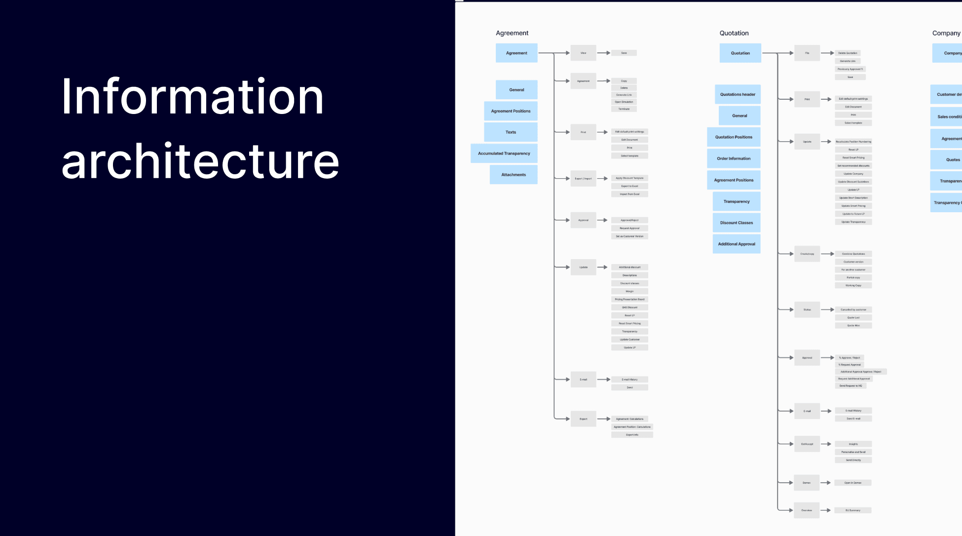
- Performed architectural mapping of the UI to understand and optimize the system's structure
- Analyzed the placement of navigation elements and the relationships between different functions

The process and result
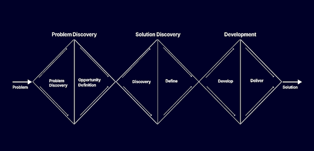
We followed a "Triple Diamond" UX design methodology, focusing on creating value for users. The process involved:
1. Analyzing user needs across different countries and business units
2. Developing prototypes for key areas: home view, navigation, and agreement positions
3. Conducting multiple rounds of user testing
4. Iterating on designs based on feedback
5. Creating detailed design specifications and Jira tickets for developers

The result was a cleaner, more intuitive interface with improved navigation, contextual actions, and a more efficient layout for managing agreements and quotes. We also provided recommendations for future improvements and a phased implementation approach. The new design aimed to significantly improve user productivity and satisfaction while accommodating the diverse needs of Siemens' global sales force.
